It was about 6 years ago that I announced a change in direction. I transformed this website from a personal soapbox into a place where I documented where natural and build environments collided.
This was primarily though pictures / text on social media. And it was in May last year that I began backing that work up and migrating it permanently here.
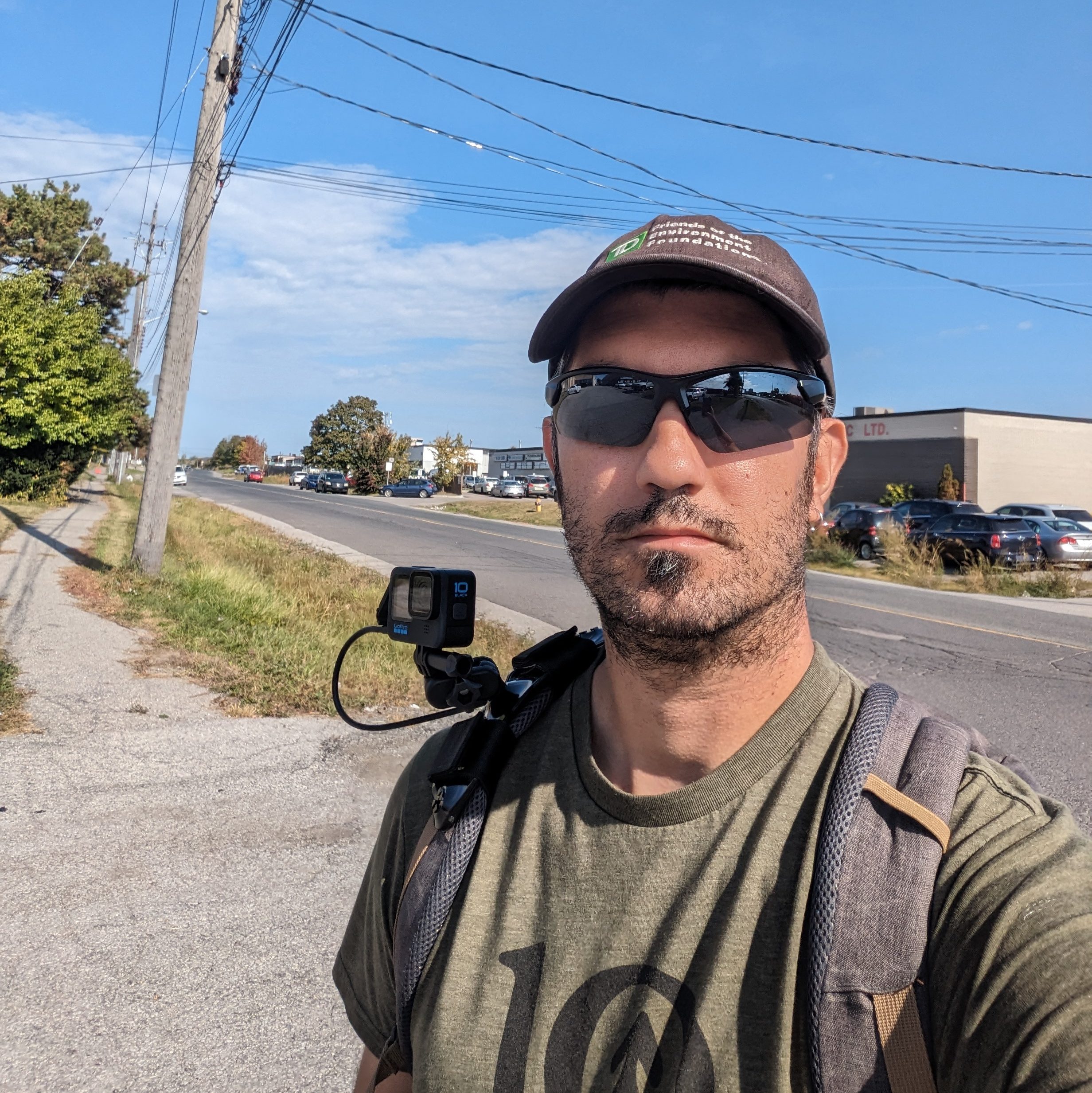
For a while now, I have been brainstorming how to make the leap from pictures / text to video.
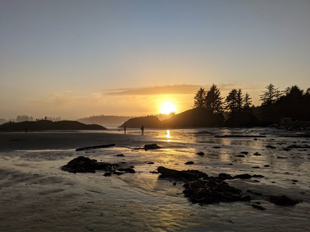
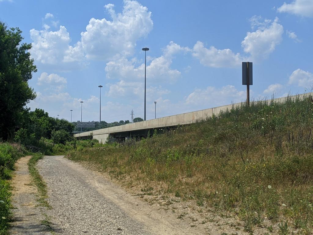
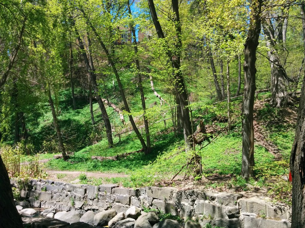
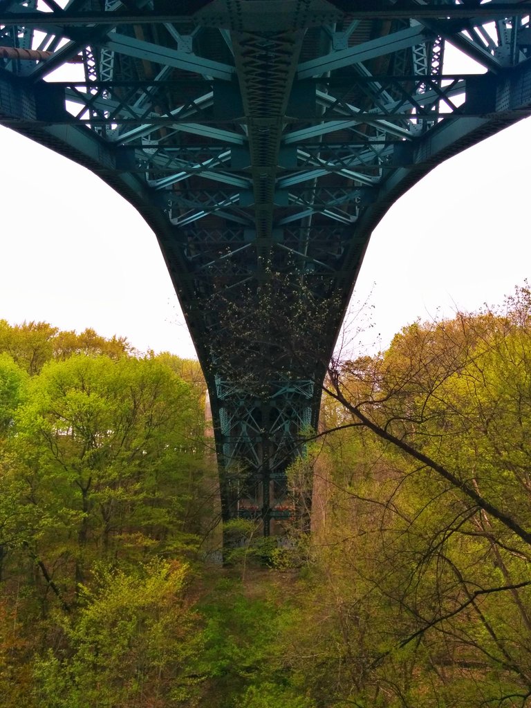
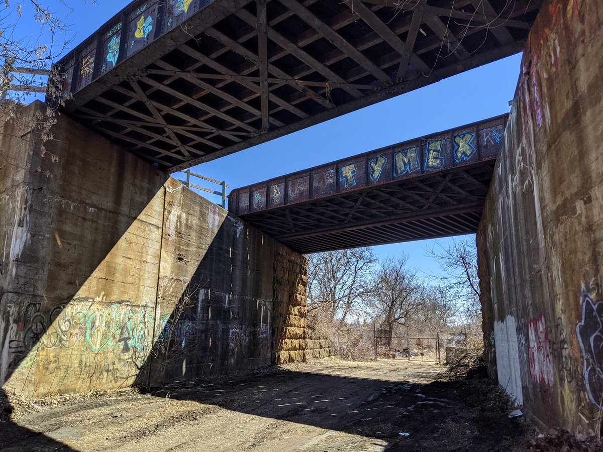
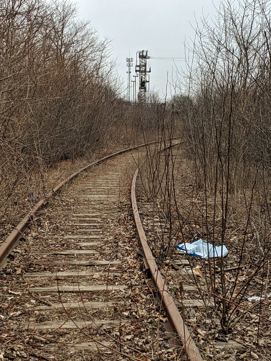
And on October 1, 2023, I borrowed a GoPro from a friend to test the concept I’ve had in my mind. This is a sneak preview of that test. And I hope, the foundation for the next chapter here.
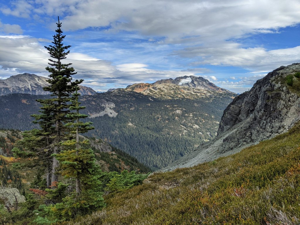
I went on vacation in Sḵwx̱wú7mesh (Squamish), Tla-o-qui-aht Sound (Tofino) and Yuułuʔiłʔatḥ (Ucluelet) almost two years ago. It goes without saying, but there’s nothing like the west coast of Canada. Rocky mountains and misty forests at the edge of the continent make for some amazing ecosystems and small town experiences.
I loved it. It’s quite different from the southern Ontario metroscapes we’re used to. But I had to wonder: is it the geography alone that makes it special?
Me and a fellow Ontarian met up with our two other former roommates at their hometown, at the north end of Átl’ḵa7tsem (Howe Sound), a recently designated UNESCO Biosphere Reserve. They definitely “live the west coast life.” Camping, hiking in the mountains, climbing rock faces, driving forestry roads. The Rockies, glaciers, rivers and coastlines are their playground. And while technology is an aid, lots of it is done on the basis of paper guides, trodden footpaths, and advice from other locals.
But “the west coast life,” or even a west coast vacation, doesn’t have to be all that extreme. There’s scaled-down accessible camping, hiking and tourist attractions for less able-bodied folks, and everything in between. The key is it’s there, with the necessary access, infrastructure and wayfinding. The need for this is driven by demand by BC residents who want to take part in this stuff, and business that rely on the tourism.
Back in southern Ontario, it doesn’t look the same. Some of it can be chalked up to not having mountains, but another chunk of it is a lack of investment. Tourism in this part of the country feels like a series of destinations to go eat and buy stuff, all linked by our 400 series highways and ONroutes. The tourism website also does a great job of pointing to other destinations like provincial parks or conservation areas. But it’s all so disconnected and sparse.
What is lacking is adequate recreational supply, the trails, access points or wayfinding to explore them, as well as connecting them in a cohesive network. To frame it another way, there’s a lack of ambition to invest in this stuff.
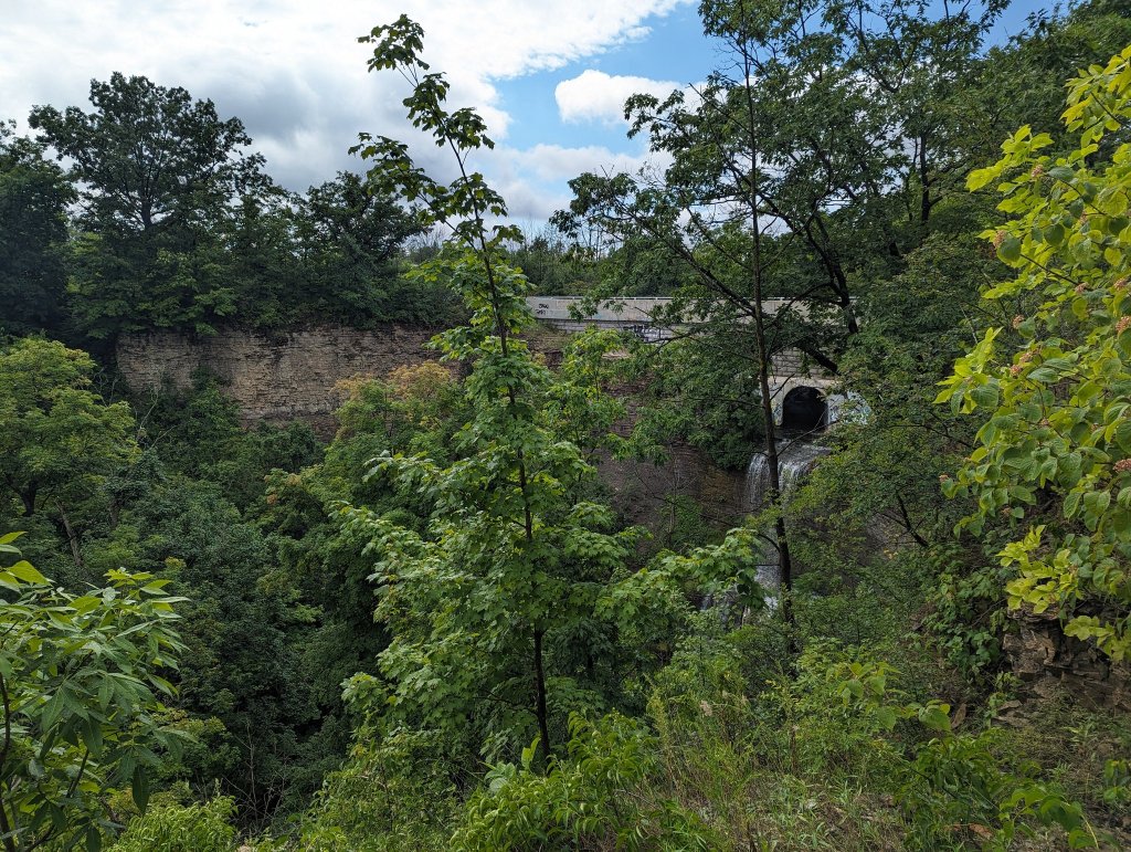
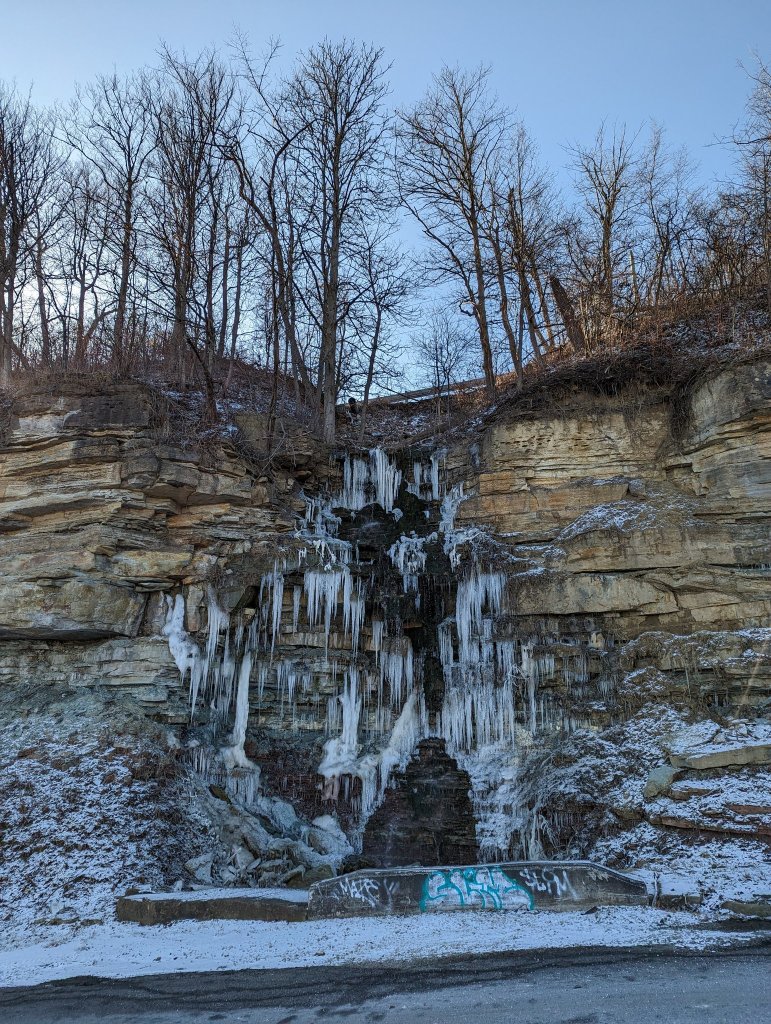
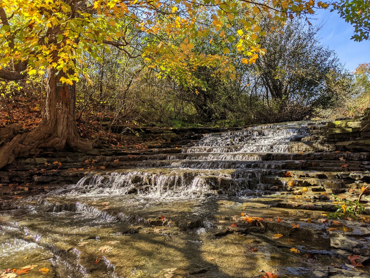
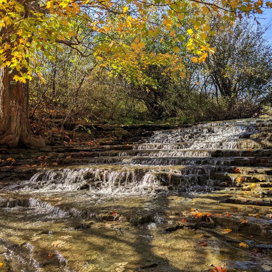
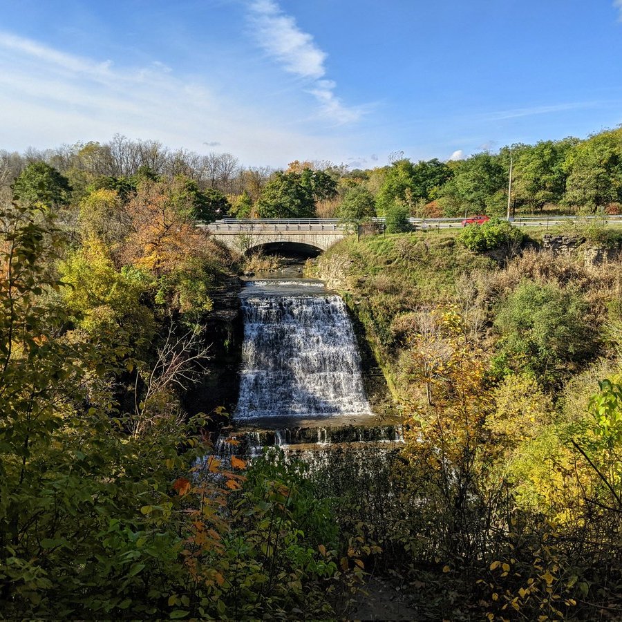
I always like to point to Hamilton’s waterfalls as a great example. There’s a number of waterfalls along Hamilton’s escarpment, but you likely have only heard of the big ones: Albion, Devil’s Punchbowl, etc. Even those ones are lacking adequate and satisfying view points, and a provincial government that actively steps in to obstruct improvements. There’s no plan to improve access to some of the lesser known and inaccessible ones, or the wayfinding to find them. Nor is there enough support for complementary uses like camping / cottaging, biking, or cafes.
That’s super frustrating when we just got through a pandemic that really emphasized how much we need public space. Making better public spaces and complementing it with nearby tourism destinations would be a ticket to increasing the tourism sector in southern Ontario.
Capture a peak? We’ve got a sizable hill in Kitchener monopolized by mountain bikers. Camping near a river? We got chunks of public land flanking big ones. Sightseeing along the Great Lakes? We’ve got a national model of a park reserve system we can follow. Beholding some fantastic waterfalls? We have knowledgeable public and nonprofit groups eager to increase access.
The west coast has shown me how you can make natural space tourist attractions and a backyard of fun for residents. I wish we could leverage it half as good as they do out there.
I’m just getting around to a year in review. It’s the sort of thing you’re supposed to have done on or close to New Years Day. But honestly, I haven’t been too motivated to go over what I accomplished in 2022, because it was a rough year for me professionally and personally. I didn’t have as much time or energy left at the end of the day, and I ended up burning out towards the end.
Nonetheless, here’s a recap. And don’t worry, things are better for me now.
Walks
In 2022, I only got out for 7 walks totalling 116 kilometres, or 16.6 km per walk. This is the lowest annual total yet. Despite this, I was able to push my all-time walk odometer over 2,250 km, which is a nice milestone.
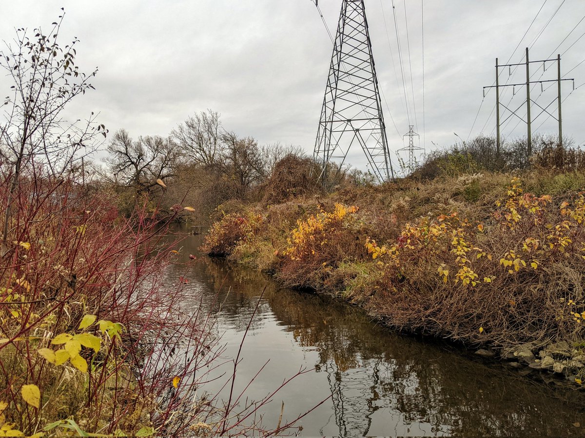
Lastly, I also made two more trips back to Toronto. One was a long re-do of a midtown hydro corridor, and the other was a trip up the Rouge River (which was cut short due to illness).
I was prompted to do this by the bird site being taken over by its new owner. Things haven’t catastrophically collapsed, they may be crumbling in the back end. Regardless, it’s still a great thing to secure your work on a domain you control. I also now have the benefit of being able to easily pull any of the almost 6,000 active walk pictures into different pages (such as those above, or these below), to make for richer content.
Refresh
I converted three more projects into GIS: Guelph watersheds, Toronto hydro corridors, and the Toronto shoreline. Maybe it shouldn’t, but it always surprises me how close my hand-drawn data was to more precise GIS lengths and areas.
Another big achievement was taking all of my project data, and providing it as open data. I have no desire to be a sole keeper of all this information, nor profess that everything I do is right, nor claim I’m doing all there is to be done for cities I cover at the time of writing.
So I’ve made my project data open for download. I hope it’s useful, and can help someone else in their own analysis.
Blog Posts
In the process of migrating my walks, I got a better recollection of how I got here; how walking and sharing on social media used to be sparse and disjointed, and grew into full documentation of certain features. The big spark for that transition was when I took a walk and documented the upper reaches of Yellow Creek.
The engagement I got on that was significant, so much so that it made me re-evaluate how I was doing my walks and what I was doing with that first-hand knowledge. It was half a year later that I relaunched this website into something resembling what it is today.
Looking Ahead
I usually have some grand things to muse about at this point, but writing this over two months late tells you where I’m at. I’m still too busy to make big promises. That’s not to say I don’t have plans, I always have plans, it’s just a long list with little time to complete much.
So, let’s just catch up in 9 months and see what’s up.
I had recently been inspired by content by Helen Mills and Lost Rivers Toronto, and decided to explore a (mostly) lost river myself. While I had been walking across Toronto since I got there in 2014, and some of my earliest walk threads date back to April 2016, this was different. Instead of a random aimless saunter, and short details or quips of what I saw (true to the Shawn Micallef style of the time), these walks had an aim and purpose, a consistent theme. And the descriptions were factual and more thorough, akin to a documentary format.
This was the foundation that this website was built upon. It took months more of exploring Toronto’s lost rivers, shoreline, railways and utility corridors for that focus and style to precipitate and solidify, and it was another year before I migrated to a platform that let me expand my city-scale analyses.
But as I’ve progressed through my migration efforts, I realized these two walks were a major milestone. I got a ton of engagement compared to prior walks, a lot of comments and appreciation of my threaded storytelling of Yellow Creek’s path. This was a bit of an epiphany, an inspiration to do what I do today.
So here’s a toast to a 5-year anniversary of that moment, that spark. All from a couple spring afternoons following an urbanized minor tributary of the Don River.
This post was originally created in May 2022. I updated it in November 2023 to celebrate the completion of this undertaking.
There’s no doubt that Metroscapes was born out of a social media following. When I get some more time, I hope to continue sharing my adventures on social media.
But in today’s digital age, I can’t rely on social media platforms to retain the integrity of my years of work. That’s why I’ve been working to back stuff up from Twitter and host it here, on a domain I can control. Aside from securing my work, this should have some side benefits such as greater cross-posting of content between pages.
I started creating new pages to re-document my walks in early 2022. And as I worked through a list of 140+ walks, I took some notes.
The walk pages include the tweeted images, which are kinda potato quality, especially the Nexus 5 ones. That’s on purpose to keep under my site data cap. One day, I’ll figure out what to do with the high quality originals. But I dug through my collection for some of the earliest walk threads (circa 2016/2017), the ones that were subject to 120-character limits and full of rambles.
My tweets were still choppy and left gaps. For example, a walk from June 24, 2017 along East Highland Creek’s East Branch left out nice shots and descriptions of how it stayed in a concrete channel (with increased green through the cracks) till it hit the 401.
I migrated a walk from December 9, 2017, which was the first one since getting the 280 character limit activated in Canada. Clearly I was still getting used to it, but it made for better threads.
Getting into mid-2018, my written documentation was getting flushed out, maxing the 280-character limit. I began snapping some my favourite Toronto shots.
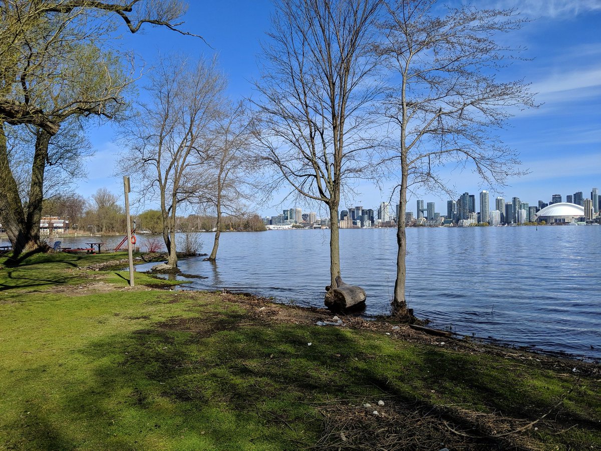
It’s funny when you end up documenting a minor notable event in Ontario history. As I drafted pages for 2019 walks, I was reminded that was the year Lake Ontario hit record levels. How it disrupted the metroscapes is something else to look back on.
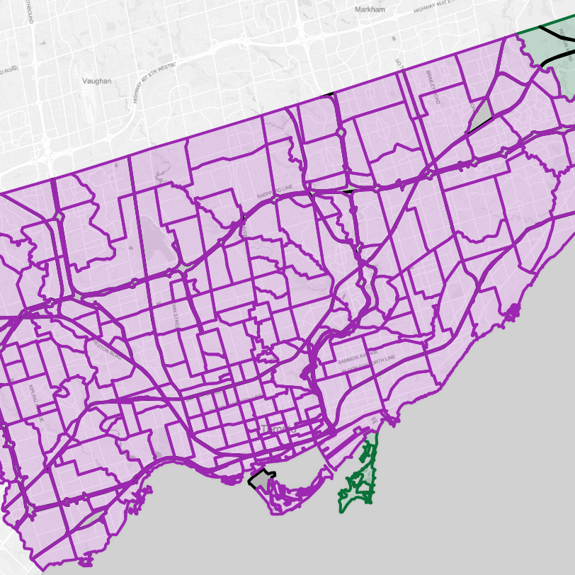
2019 also marked my last year living in Toronto and I was able to maximize the benefits of planning my walks, covering ravines, shorelines, hydro corridors, railways and highways. All elements of what I do.
After that summer of fun, I took my first walks in a new region, with the website fresh from being morphed from a Toronto-centric photo album into a multi-city project. But I still made time to return to where it started, especially if it meant walking alongside a key inspirational figure for my exploration of the city.
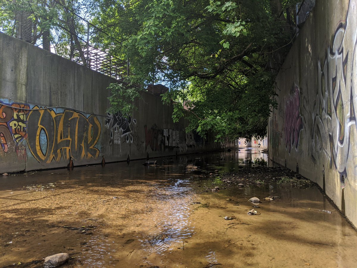
My first walk after a global pandemic was declared was strange. Short walks along utility corridors and railways, constrained to a small radius. It seems like a lifetime ago. But learning more about the virus, gathering the courage and physical strength for longer stretches, and yearning for the beautiful weather brought me back to the rivers and creeks, urban and natural.
Later that year, despite the pandemic, I took the leap from a project exploring where I live, to a truly multi-city project. I started exploring in Hamilton. Taking public transit again allowed me to tackle a wide swath of area.
Anyway, after 8 months, I finally uploaded 5,647 of the pictures I had taken to that point. I created 126 pages for most of my walks, and filed another 40 walks into an archive. But I can tell you being able to create new projects or blog posts, and easily recall from this collection has been one of the greatest things I’ve ever made.
I hope you enjoy what I have made, and what I will make for years to come.
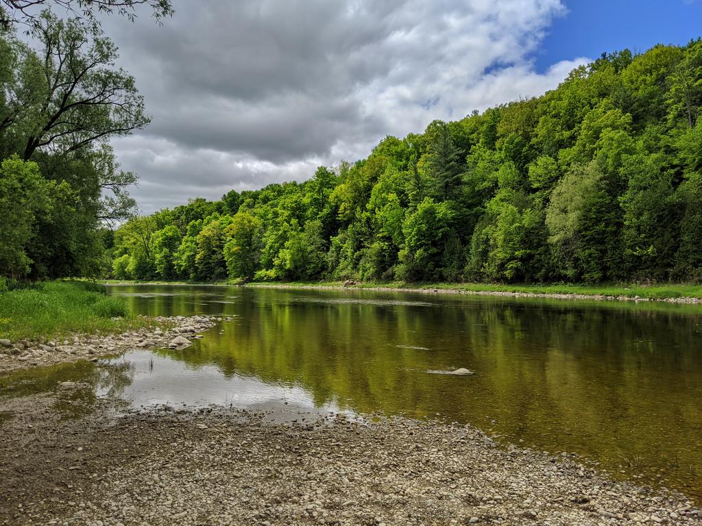
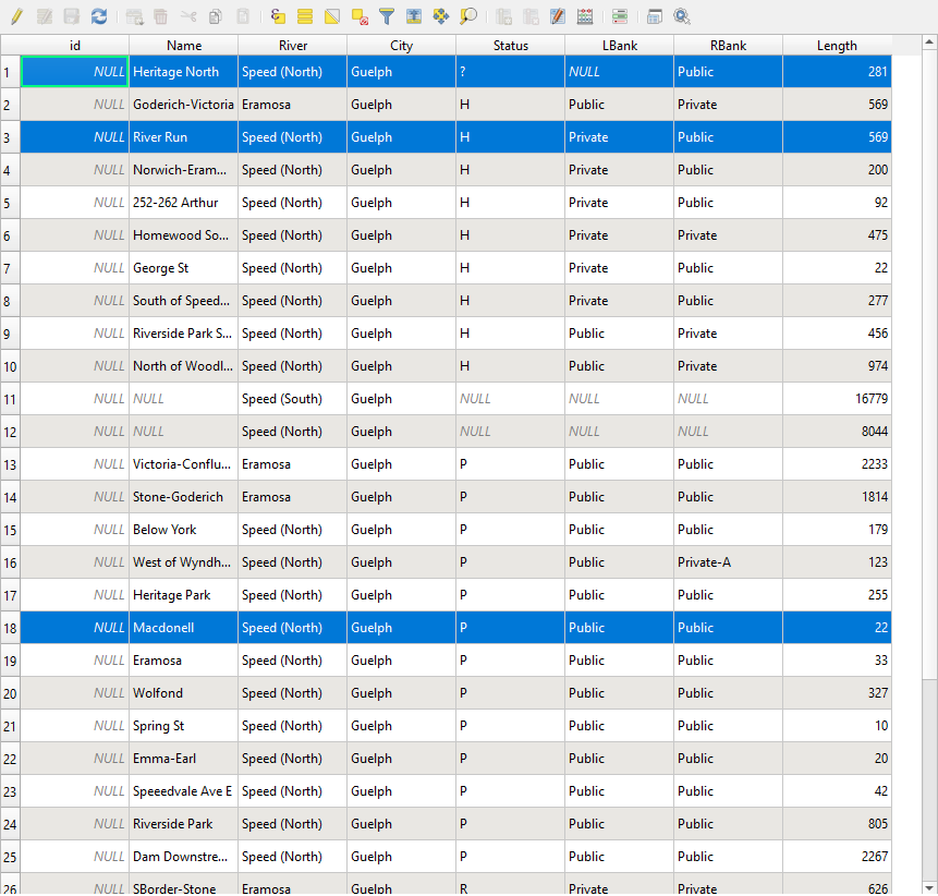
As alluded to in my previous blog post, GIS is enabling me to create new projects and types of analysis. One of the first new projects, which I am publishing today, is “Riverbanks“. This is an analysis of the ownership and public access to each side of a major river.
This has been a long term goal of mine ever since I moved out of Toronto and expanded Metroscapes to the Tri-Cities. I wanted to expand my first (and probably still best) project, the Toronto Shoreline. It’s the closest analogue.
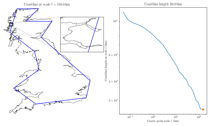
Problem one: the coastline paradox. The “length” of a shoreline (or frankly, any other geographic feature you can measure) wmill vary with how much detail or generalization you use. I used less cartographic generalizarion in Toronto because it has ‘longer’ points of shoreline (e.g. peninsulas) that (arguably) increase public space.
But it does not work the same way or at the same scale on a river. Toronto’s peninsula parkland can stretch out from the mainland for hundreds of metres, whereas Guelph’s two rivers are maybe 20 metres wide. 3 kilometres of public shoreline over a 16 hectare area is not the same as 170m of riverbank in a 0.16 hectare tailwater. There’s just not as much benefit.
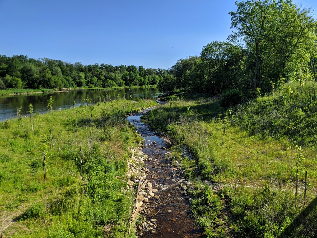
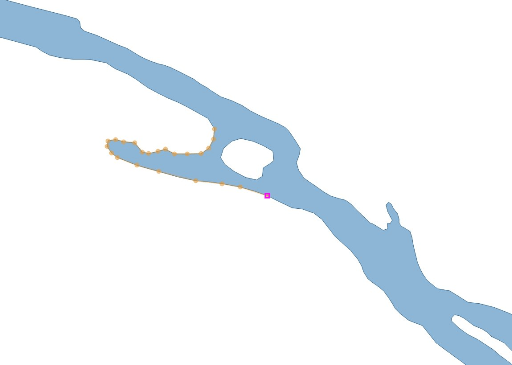
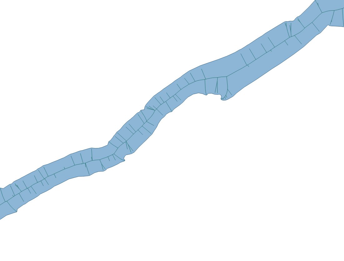
So I needed some other way to measure a river. I used river polygons downloaded for free from the conservation authority and generated a centreline within it with GIS. Then I broke up the banks and the river centreline using parcel data to create somewhat precise segments. Creating these and obtaining their lengths is relatively quick work thanks to tracing tools and table functions in GIS. Then I joined two tables to connect a bank segment to a corresponding centreline segment.
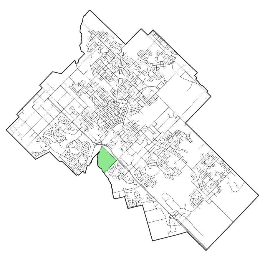
After much slicing and dicing, and adding in metadata, I created the Guelph Riverbanks project. You can now see what stretches of river (i.e. a characterization of both banks) have public access, and a breakdown of each bank in terms of a category.
Throughout my research in putting this together, I came across a couple interesting backstories that may bring more of Guelph’s riverbanks into the public realm.
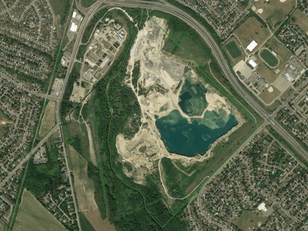
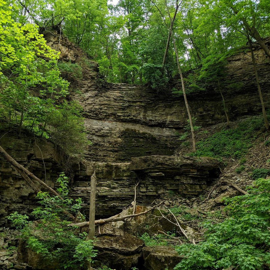
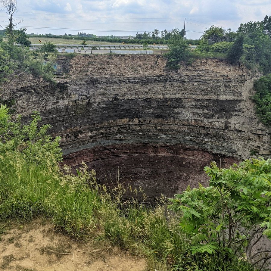
Dolime Quarry
For some time, there has been a big divot in Guelph’s west perimeter. This is the Dolime Quarry, a limestone pit bounded by the Speed River, College Avenue and Highway 6. Opened in mid 1850s, this was a major source of building material for many of Guelph’s historical structures, but it technically operated within neighbouring Guelph-Eramosa Township.
In 2002, the City began investigating and raising concerns about the quarry’s impact on local groundwater, the City’s drinking water source. A few years later, evidence emerged that it was a significant threat, and with that, the City successfully appealed a provincial water taking permit needed to operate the quarry in 2014.
The City and the quarry owner then negotiated an agreement to convert the quarry into a residential area over the next few years. A ministerial zoning order to implement the agreement was granted on December 6, 2021, and as of New Years Day 2022, the quarry was annexed to become part of the City of Guelph.
I’m less interested in this becoming a residential neighbourhood, and more interested in it becoming a publicly accessible riverbank and an enhanced riverine valley area. An environmental impact assessment will be done to create a baseline inventory and help set the minimum bounds for protection. I’m hopeful that this will create a fantastic strip of parkland for people and nature.
I stumbled upon and gathered much of this information thanks to newspaper articles by Cameron Shelley. You can find more details here at his website: guelphpostcards.blogspot.com
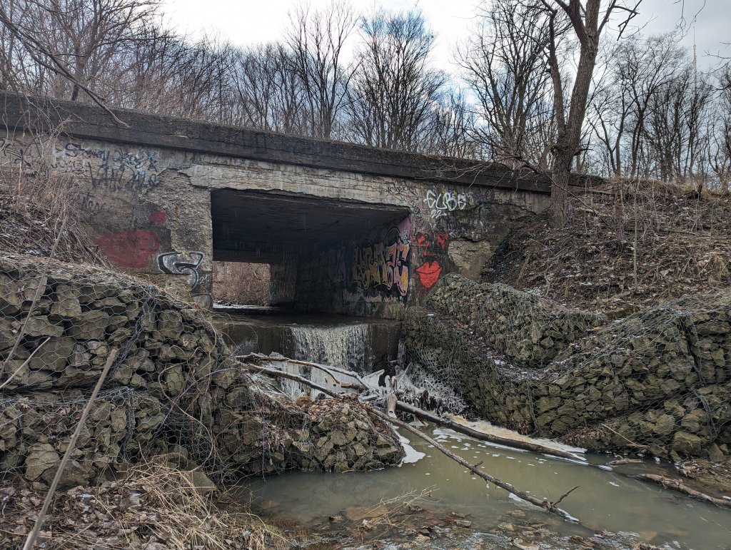
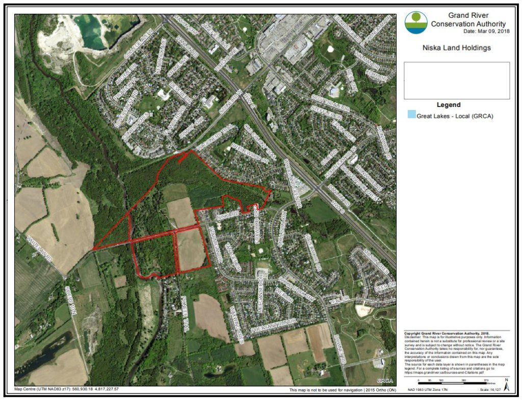
In 1948, Horace Mack purchased patch of land north of Niska Road and east of the Speed River, municipally know as 308 Niska Road. Mack had a passion for birds, waterfowl in particular, and it was here he set up the Niska Waterfowl Sanctuary.
He passed away in 1959, and after a decade of operations, it was facing financial trouble. So naturally, the Ontario Waterfowl Research Foundation purchased the land in 1961 and turned it into the Kortright Waterfowl Park. It became popular both as a park and a research centre. But as popular as it was, the Foundation still couldn’t keep the place afloat, and went looking for buyers in 1975.
At that point, the Grand River Conservation Authority came into the picture. One may think it was all for conservation purposes, but in reality, the authority already held lands in the area for a potential dam (which would require a large headphone in behind it). They purchased the land in 1975, securing 47 hectares in addition to the 17 hectares they already owned around it for this potential future dam. In the meantime, they leased it back to the Niska Wildlife Foundation to operate the park.
But nothing ever came of the conservation authority’s original plans. After completing an updated water management study using updated hydraulics, the idea for a dam at Niska was ditched. The Kortright Waterfowl Park continued operations, but facing decreased attendance and mounting bills, the park closed for good in 2005, and the Foundation’s lease was terminated in 2015.
Over the past few years since, the conservation authority has picked away at removing buildings, infrastructure and other remnants of the park that once was. The debris and disrepair makes it hazardous, and so it remains closed to the public. Also during this time, the city was reviewing their land use planning, and some of the eastern portions of its Niska Lands were marked for potential new residential development.
This triggered an appeal by a member of the public, and resulted in a settlement between the conservation authority, the city and the appelant in March 2018. As part of the settlement, the lands must have a management plan with public input (which includes a dedicated webpage to provide updates), and which may include a trail system along the east bank of the Speed River and the lower reach of Hanlon Creek.
Another pandemic year has passed. This marked a year of knowing more about the virus, getting vaccinated, loosening restrictions with precautions in place, and tightening back up due to variants.
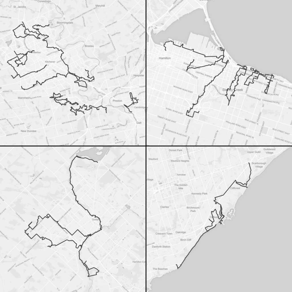
As for exploring metroscapes, it was yet another year of doing less than I hoped, but still accomplishing a lot. It was my second full year hailing out of the Tri-Cities as my home base. It also marked a year of expanding to a fourth city, and completing walks in all four cities.
With that, let’s do another year-in-review, and go over the ground that was covered in 2021.
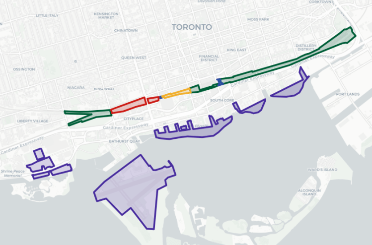
I also did an analysis of potential parkland in Toronto, following the defeat of the Rail Deck Park proposal. I’m still think there was a $2 billion commitment made to building parkland in downtown Toronto. There’s tons of opportunities on both public and private lands, and you very well may get way more and/or parkland for your buck.
Walk Statistics
I saw a decline in activity from last year. This year was less restricted by the virus and more so by commitments (and exhaustion from them) at home and work.
Over 16 walks, I covered 303 km, about the driving distance between Fort Erie and Brighton. That’s down 130 km from 2020.
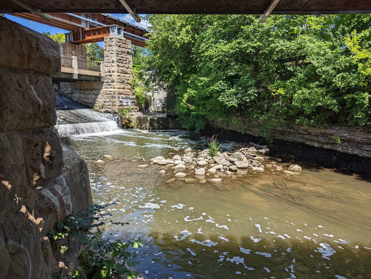
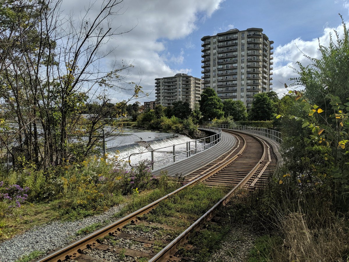
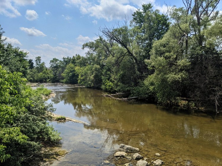
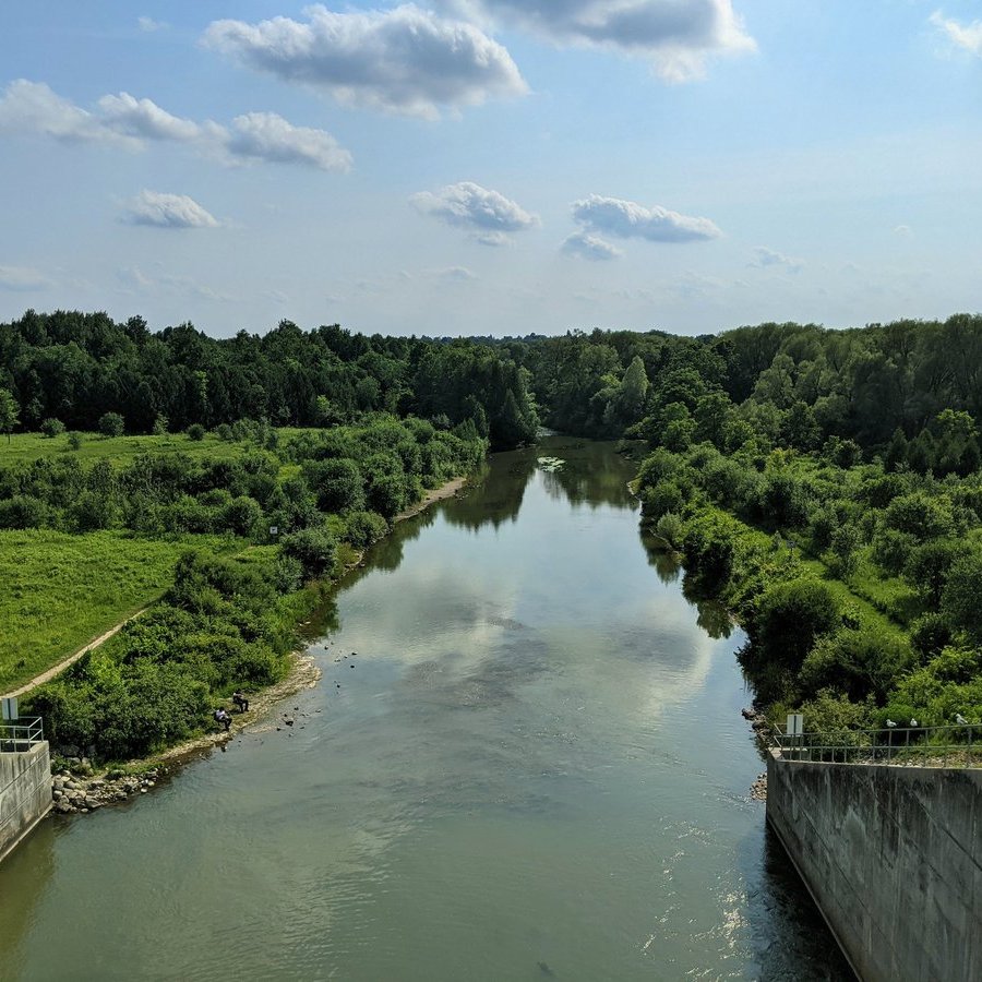
The average walk was 18.9 km, up 3.5 km from 2020. This is twice the walking distance along the Speed River in Guelph, between Edinburgh Road and Guelph Dam.
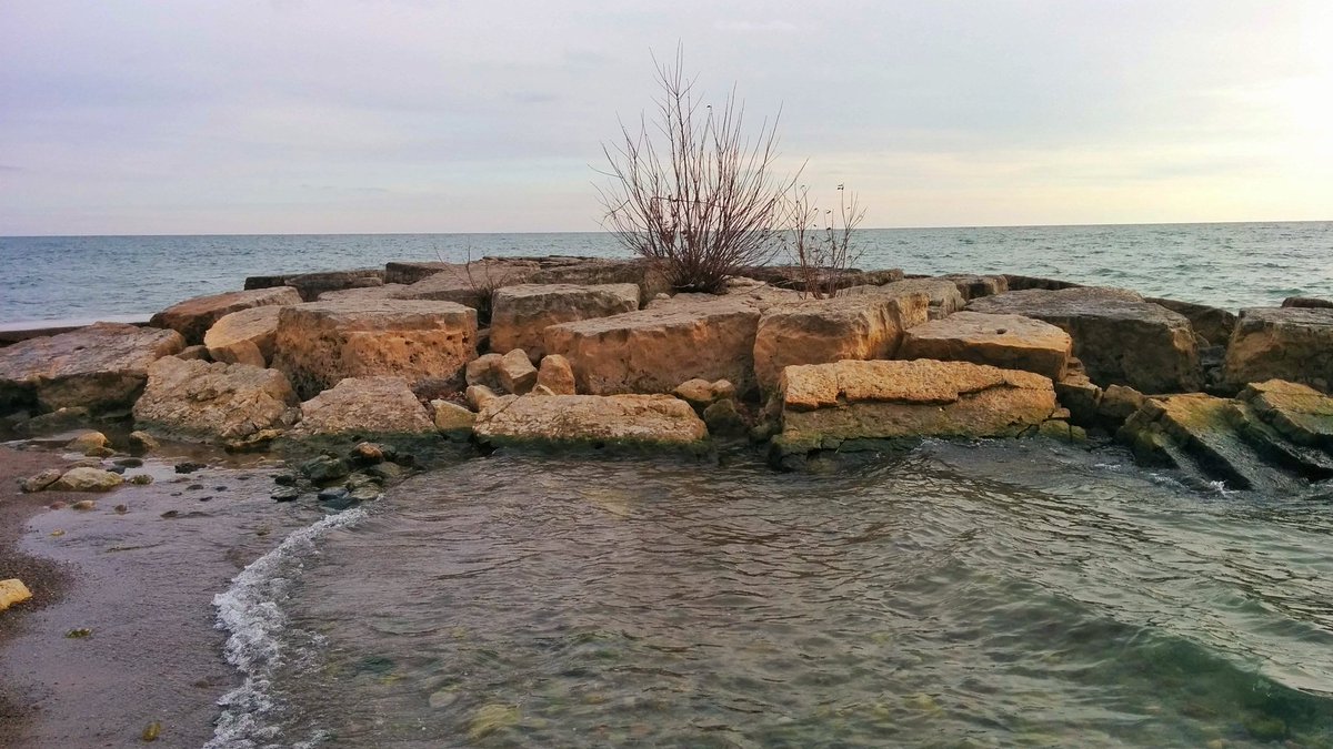
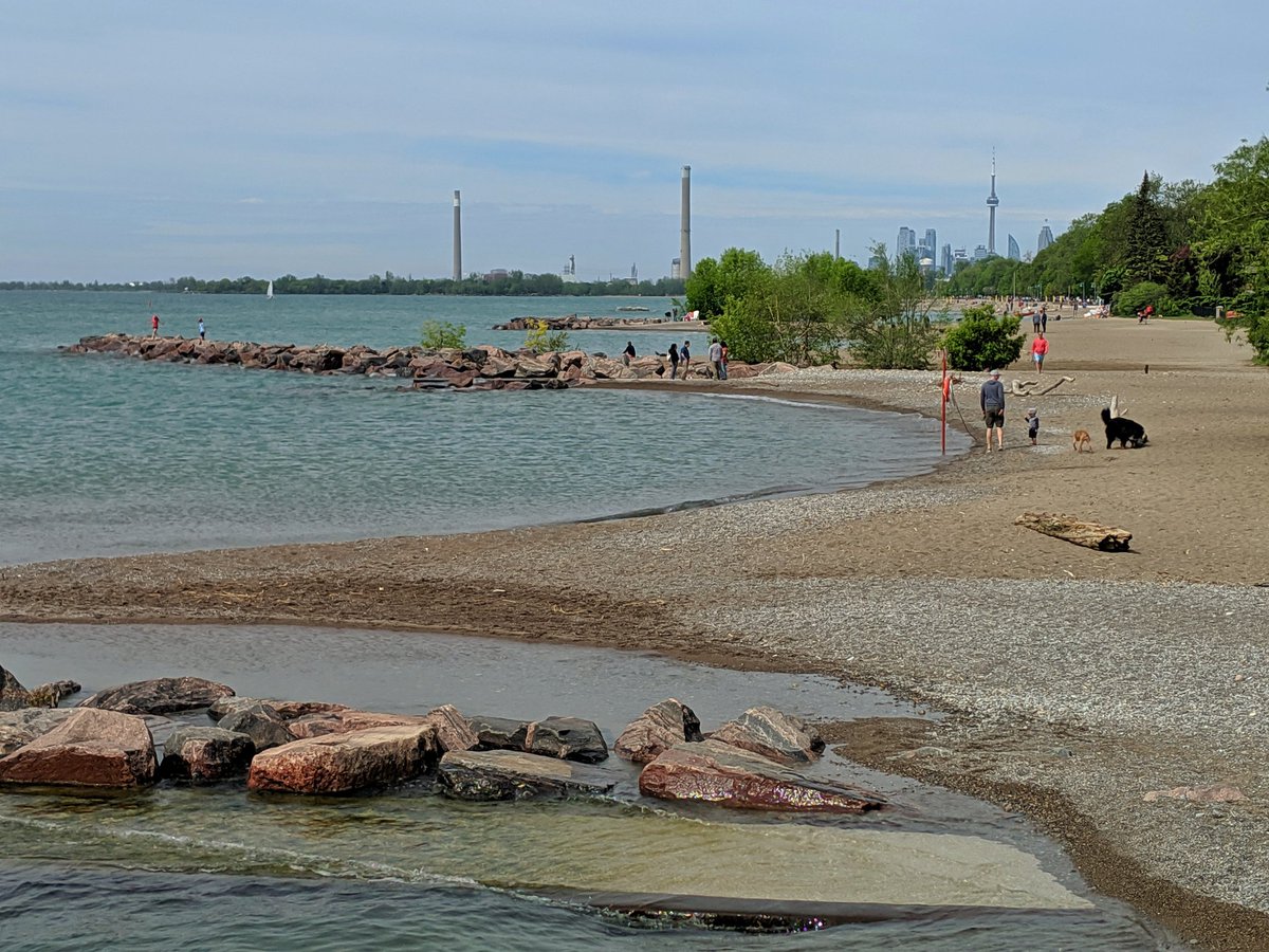
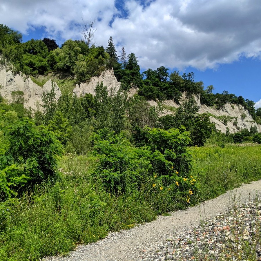
The longest walk was August 2, when I hiked 24.0 km along Toronto’s lower bluffs and small ravines. It may have been more as I’m not sure that accounts for vertical elevation.
Walk Highlights
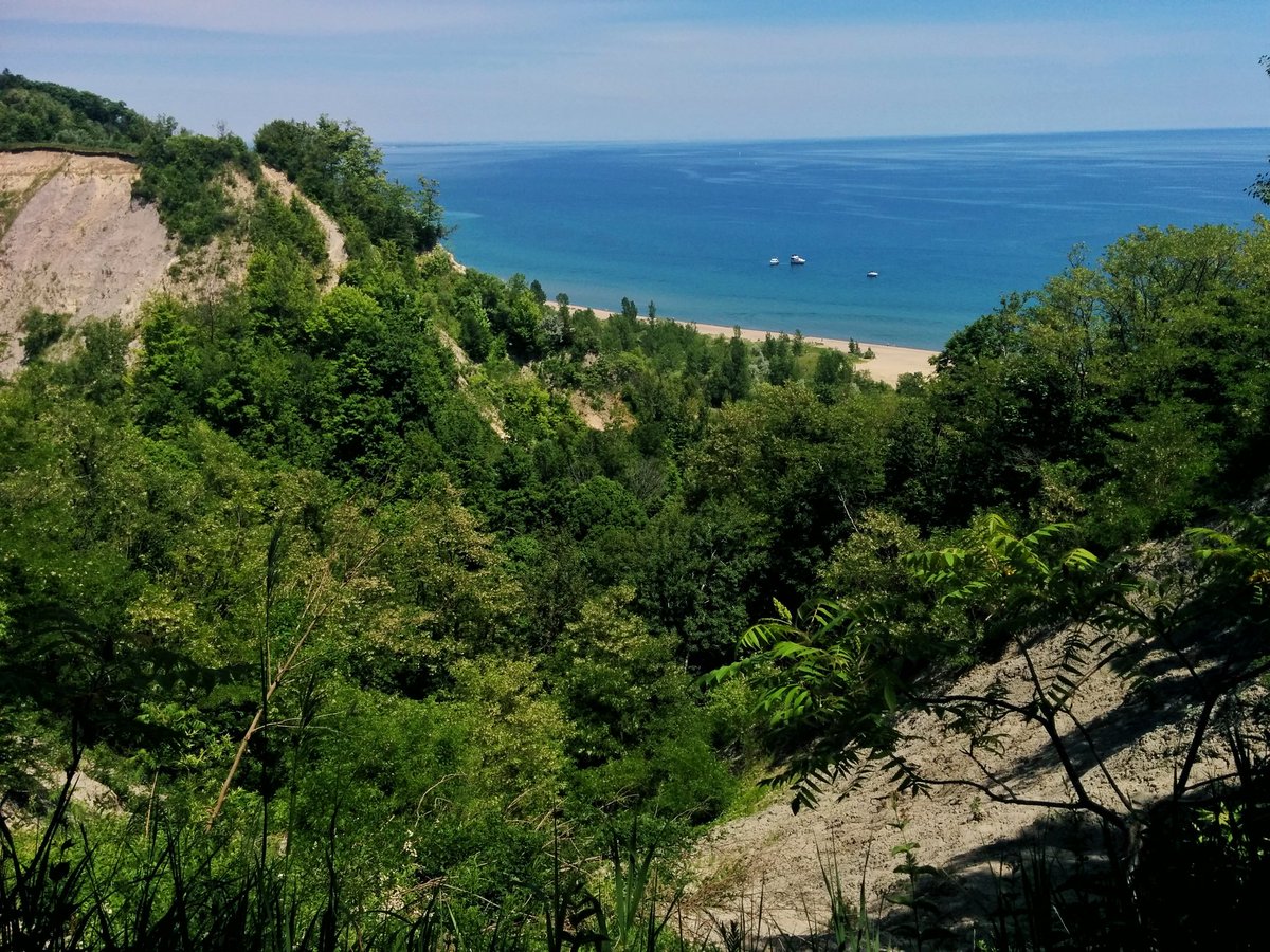
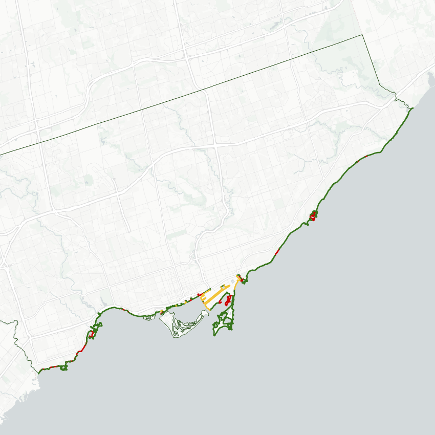
I got to Toronto and checked a big to-do off my list: Scarborough’s lower bluffs and small ravines. The beaches and armourstone shoreline were something to behold, as was the infamous cliffs at Buffers Park. While there’s room for improvement, these are hidden gems of Toronto’s waterfront that may get more accessible in the future.
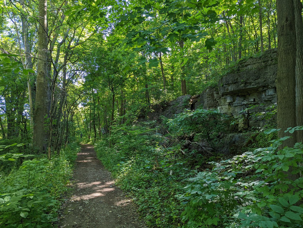
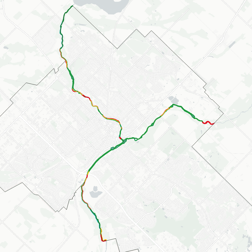
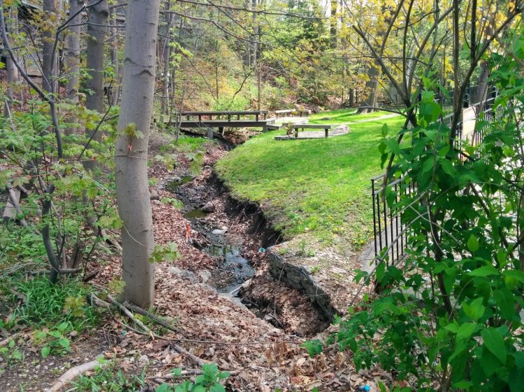
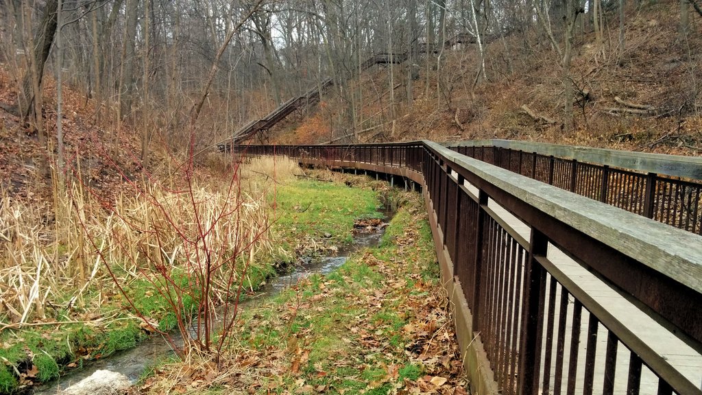
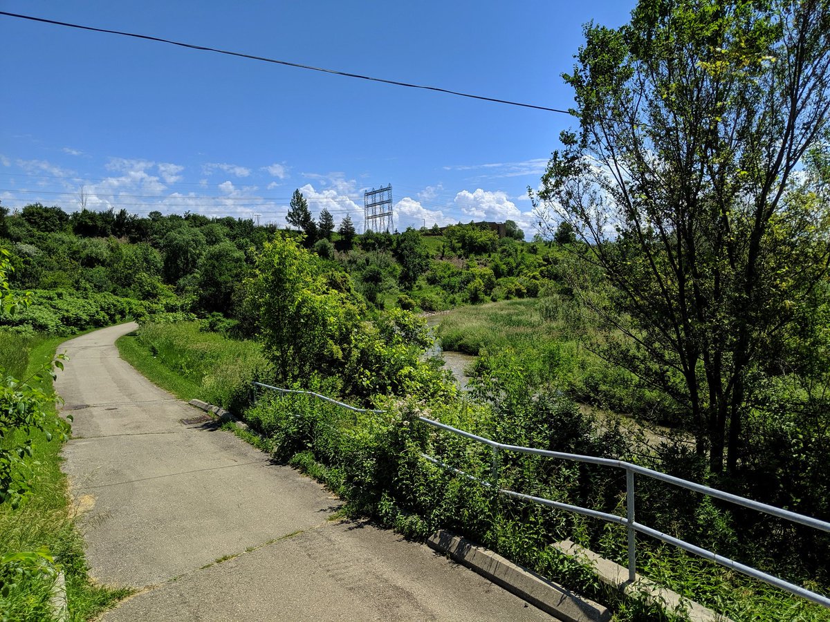
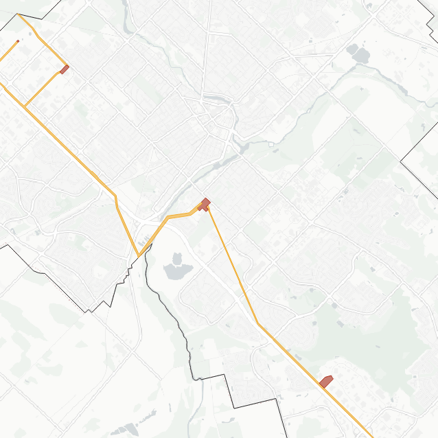
I traced the entire Speed River within Guelph’s urban boundary, from Niska Road in the southwest to Guelph Dam in the northeast. I knew many of the local trails from my previous days living here and visiting occasionally, but I had less experience along the south reaches. This was a very high quality ravine and I am hoping for expanded public access along there in the future.
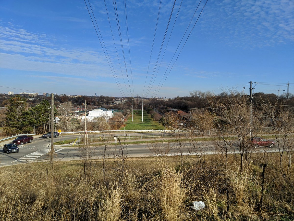
Back home in the Tri-Cities, I completed almost all there is to complete. After paralleling the north and west parts of the Conestoga Parkway, walking along some more hydro corridors, and tracing some smaller watercourses, I only have 3 or so walk plans left for the KW and Cambridge area.
Looking Forward to 2022
As highlighted in my recent blog post, I completed a course in GIS, and am actively working to convert all existing metroscapes data to a vector shapefile format. This will be the driving change to this website and any other analysis in 2022.
I may continue to be constrained by family life for a little while. But I’m hoping to get some more walks in soon. Cheers to more walking, defeating COVID, and a more balanced life in 2022.
In 2014, I moved to Toronto, and I needed something to fill up my time on the weekend. I started taking walks. Lots of them, one or two every weekend. I even started tweeting about them and adding pictures.
Then on February 15, 2015, this website was launched as a clunky Blogger site. It was a place to rant about the days in Rob Ford’s Toronto, but I also added a page to track / organize some walks I had taken with a half-decent Twitter thread. It was a start.
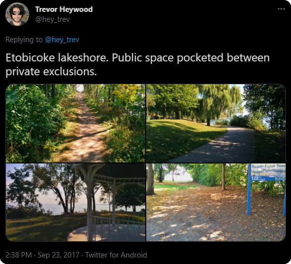
Something happened in the latter half of 2017. I took a walk along Etobicoke’s shoreline, and noticed how public access along it was very fragmented. I wondered how it compared to other parts of Toronto, like downtown, the Port Lands and Scarborough.
So I started doing something new. I mapped it out (manually), and input the data into some spreadsheets to do some analysis. I was able to demonstrate, through hard numbers, that Etobicoke’s shoreline was vastly more fragmented, and with more of it in private exclusion, compared to other parts of the city.
Blogger was not really up to the task of handling all of this new information; it wasn’t capable of embedding the pictures, maps and spreadsheets like I wanted to, or if it was, it was going to be very difficult for me to figure out how to code it. I needed a user-friendly and proper web platform.
So I did a migration 3.5 years ago, making it into something different entirely. In addition to my walks, I made a space for analysis and information about the subject matter of my walks: shorelines, watersheds, neighbourhoods, corridors.
Up until this point, it’s all been from hand-drawn digital maps I did myself, either through my own observations and/or cross-referencing other sources. It was painstaking work, but I was happy with the result.
But I knew it could be better.
These days, the most powerful maps come from a Geographic Information System (GIS), which contain multiple layers of large datasets of points, lines, and shapes and the metadata attached to them. Naturally, I was attracted to this, with the detail and the wealth of open-source data that governments offer these days, which would enable me to refine my maps. But it felt like a huge leap.
So I enrolled in and recently completed an introductory course at [X] University to secure myself some of the fundamentals. It was an eye-opener; not only was I going to make detailed maps, but I could complete a higher level of analysis. I can now draw on more sources of information, crunch out new data, and visualize it way more efficiently than I could ever achieve with hand-drawn maps and spreadsheet data entry.
How many people are a five-minute walk from publicly accessible shoreline? What proportion of ravine lands are in private ownership? Which segments of railways and highways pose the greatest barrier based in an index of population and walking distance? These are questions that I could tackle in GIS.
So I find myself at the cusp of a similar spot I was in 3 years ago, looking at my current mapping data and thinking “how did I settle for this?”
With that, you can expect changes in 2022. I started recompiling my existing data into more detailed GIS shapefiles (though I had a bit of a setback). This will unlock new projects and new analysis. It’s exciting to be on this path towards the next level of analyzing local metroscapes. And perhaps, finding a new way to spread pride in them. Thanks to everyone who’s stuck with me over these few years.
My walks usually take a couple hours to get to and from, and take a few hours to do. It’s a whole day engagement. As a father with a full-time job, that means it’s tricky to balance that with spending time with family or doing other domestic tasks.
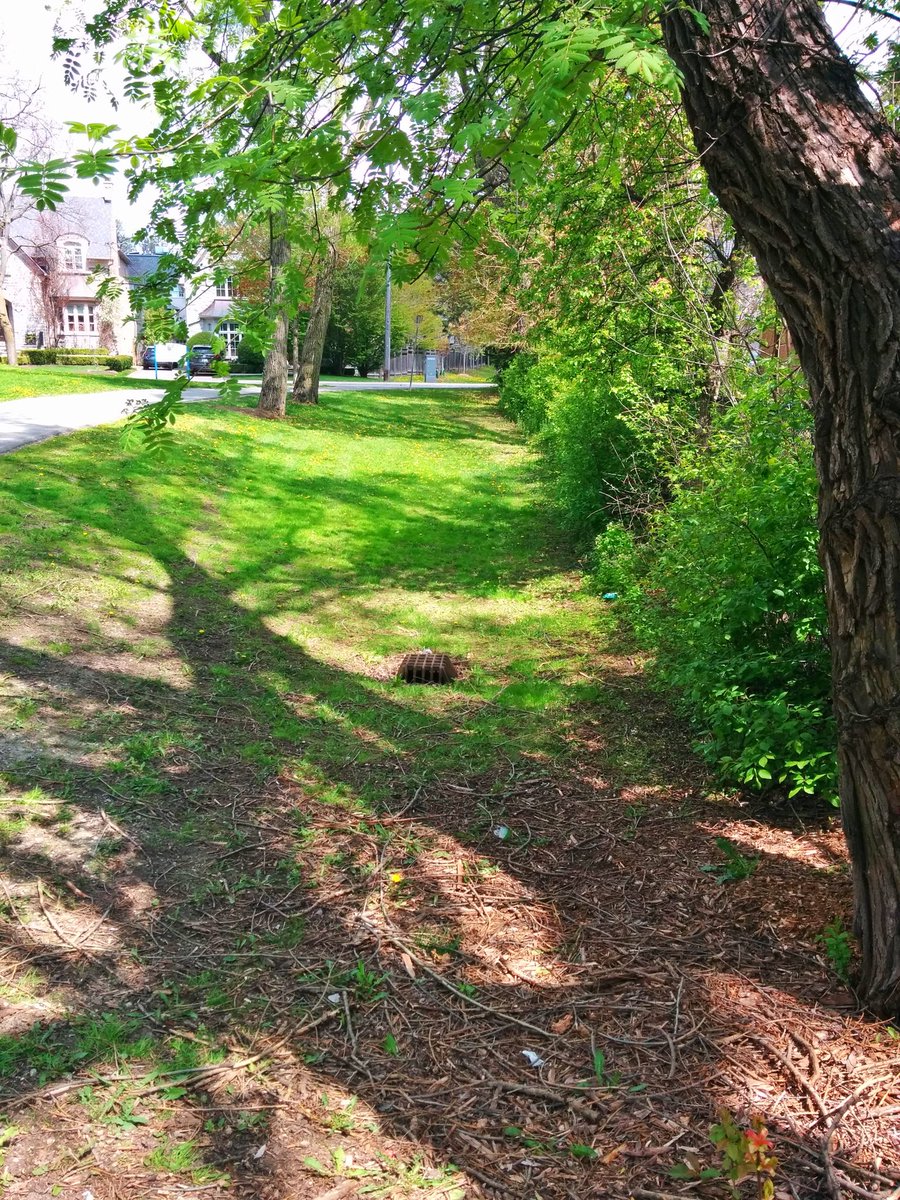
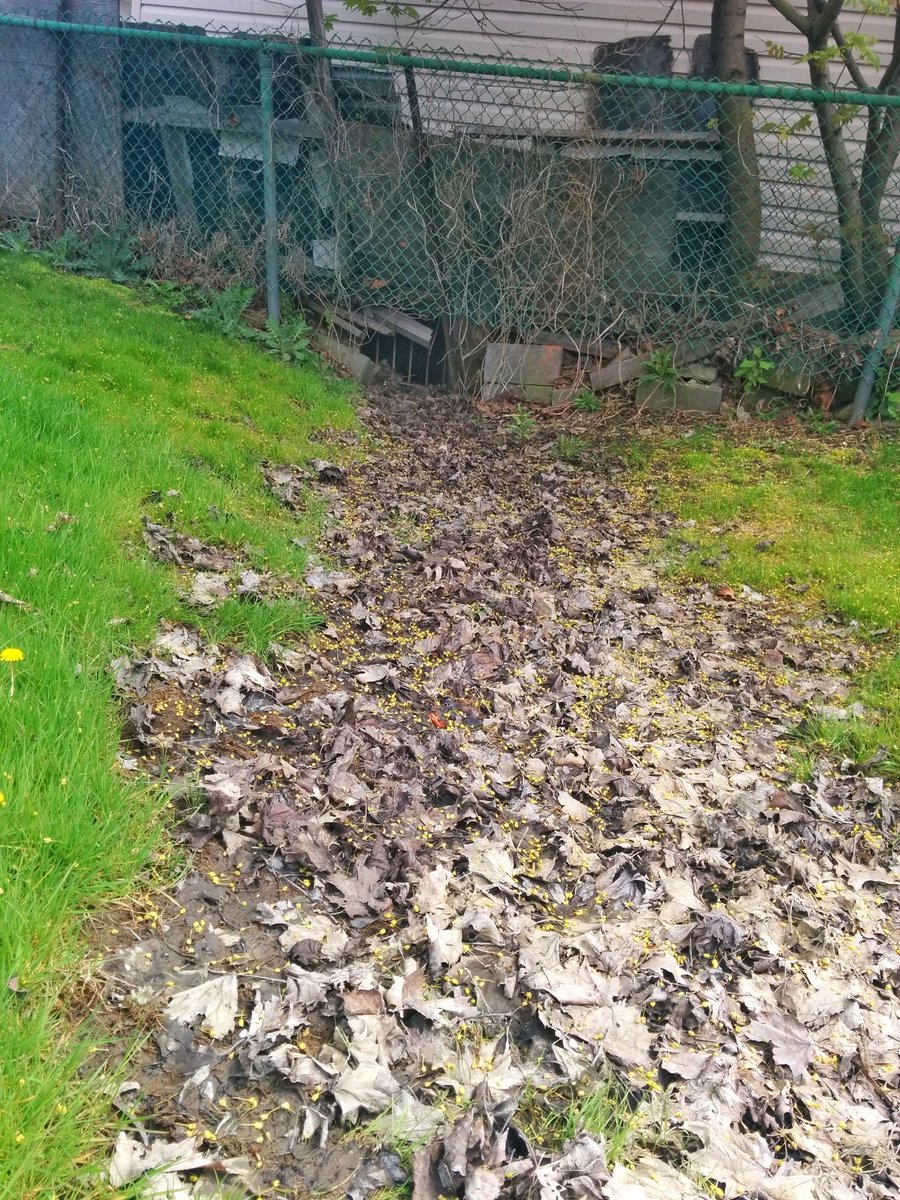
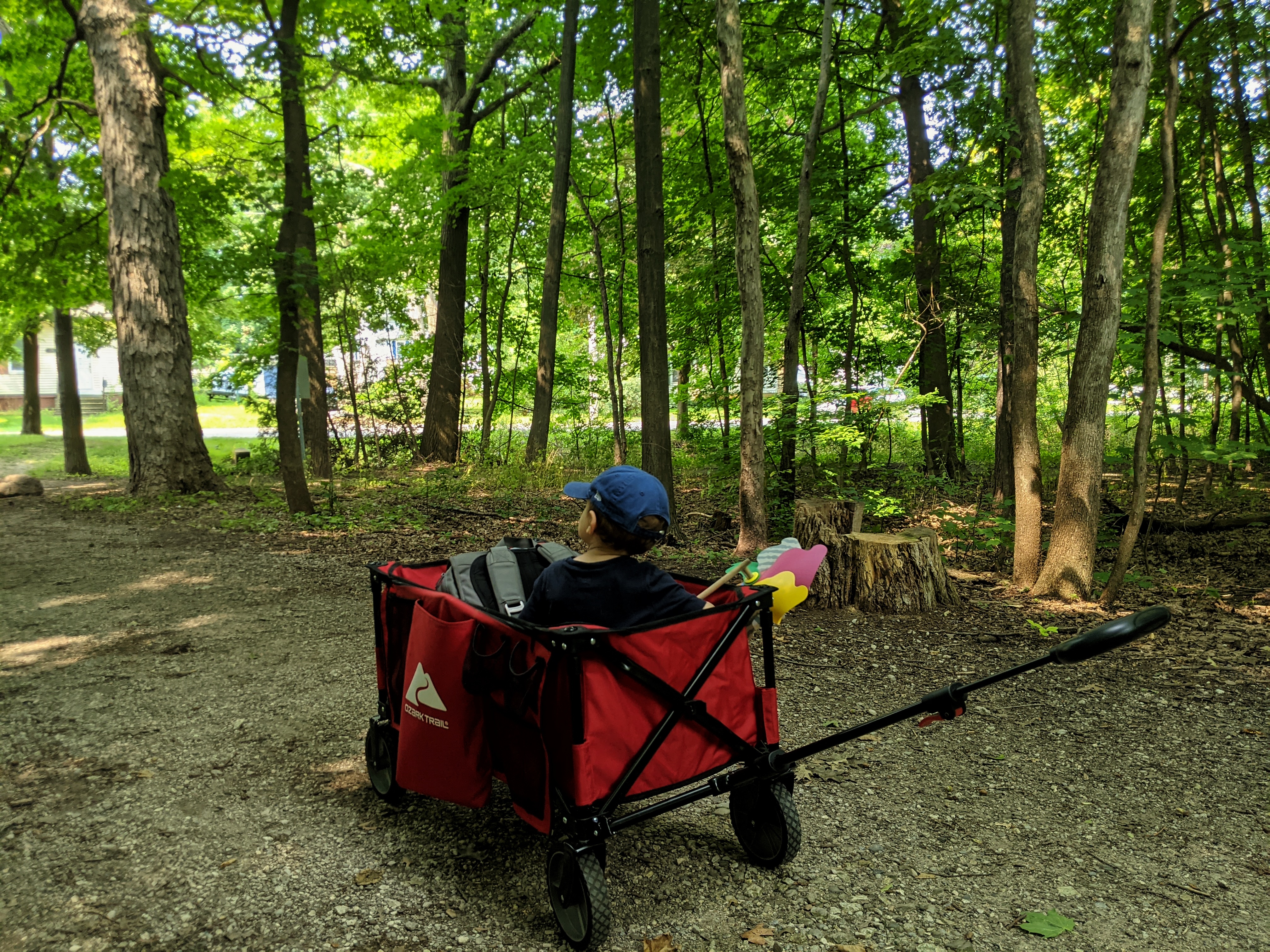
So instead of making the big trip, I’m often enjoying metroscapes that are local and smaller scale, and usually ground where I have trodden many times before.
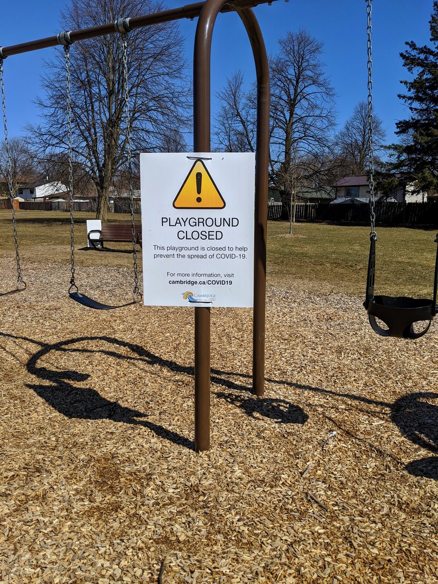
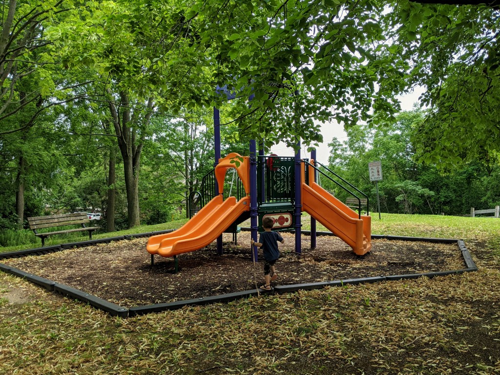
The local playground is a good escape on weekday evenings. It’s a place to burn some crazy energy, and shake off the work day. It’s also a place to reflect on where you’re at in life, and what is a priority.
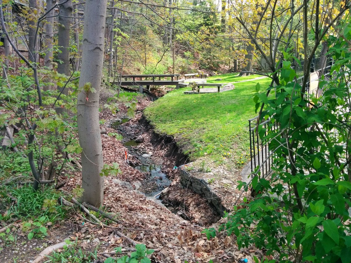
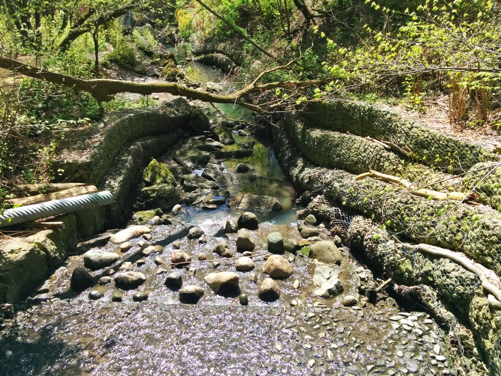
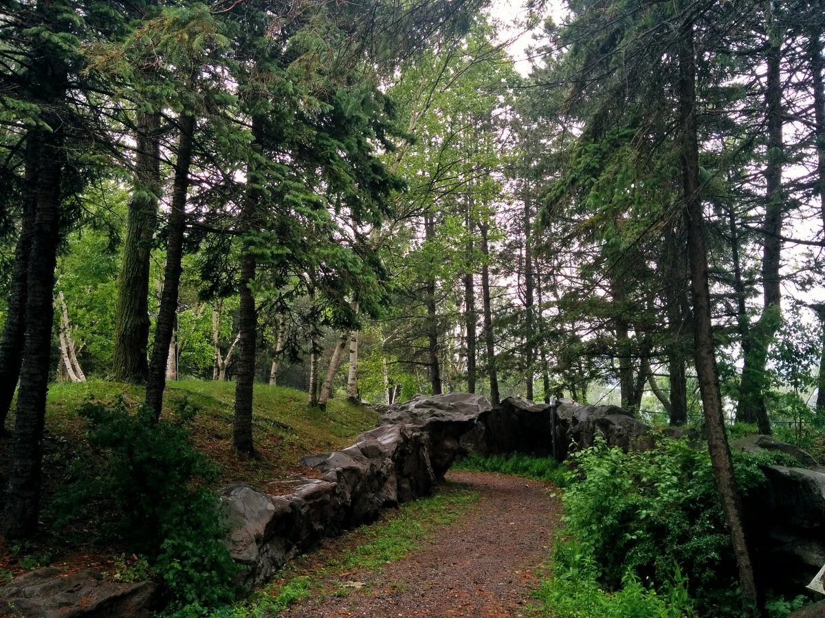
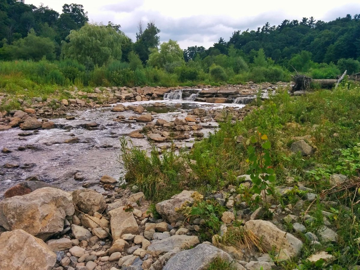
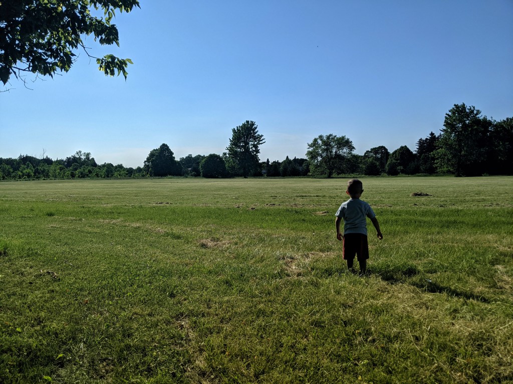
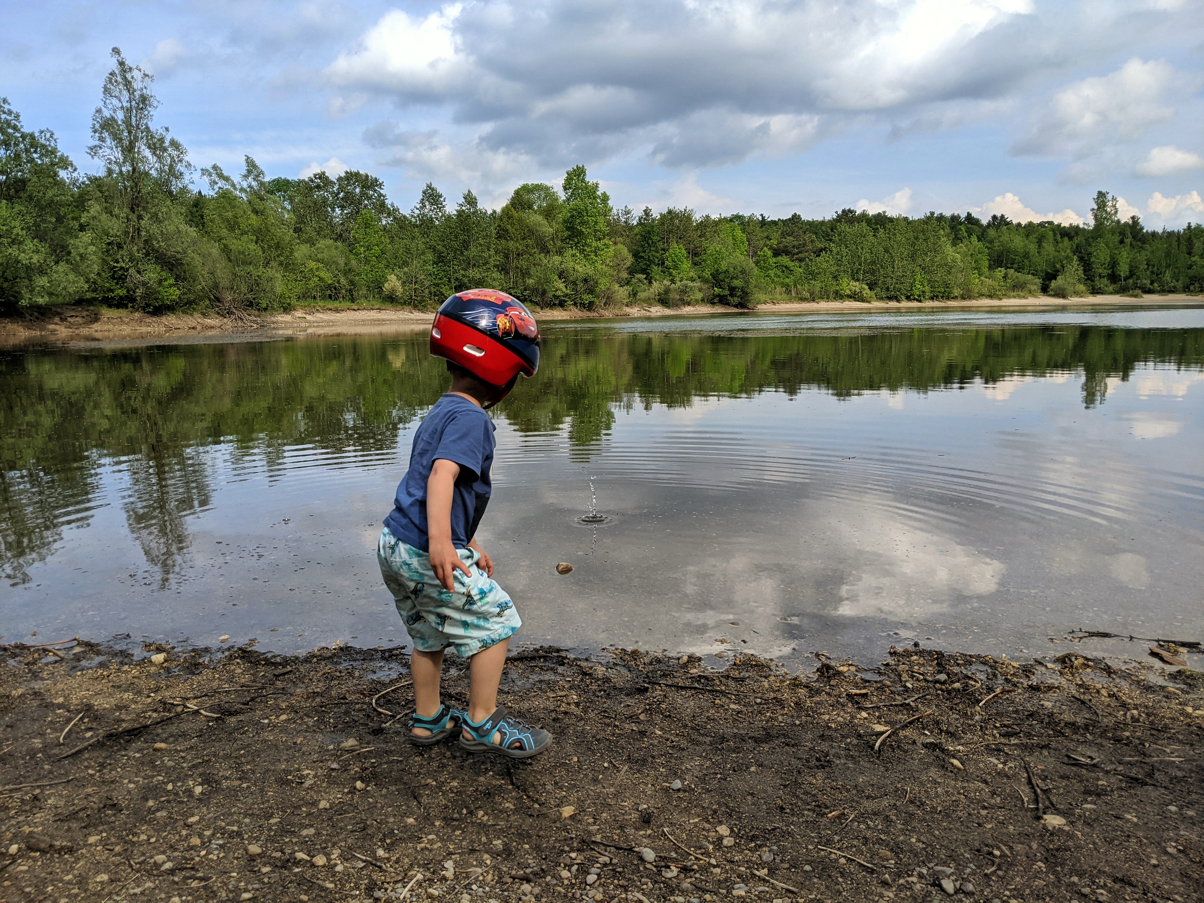
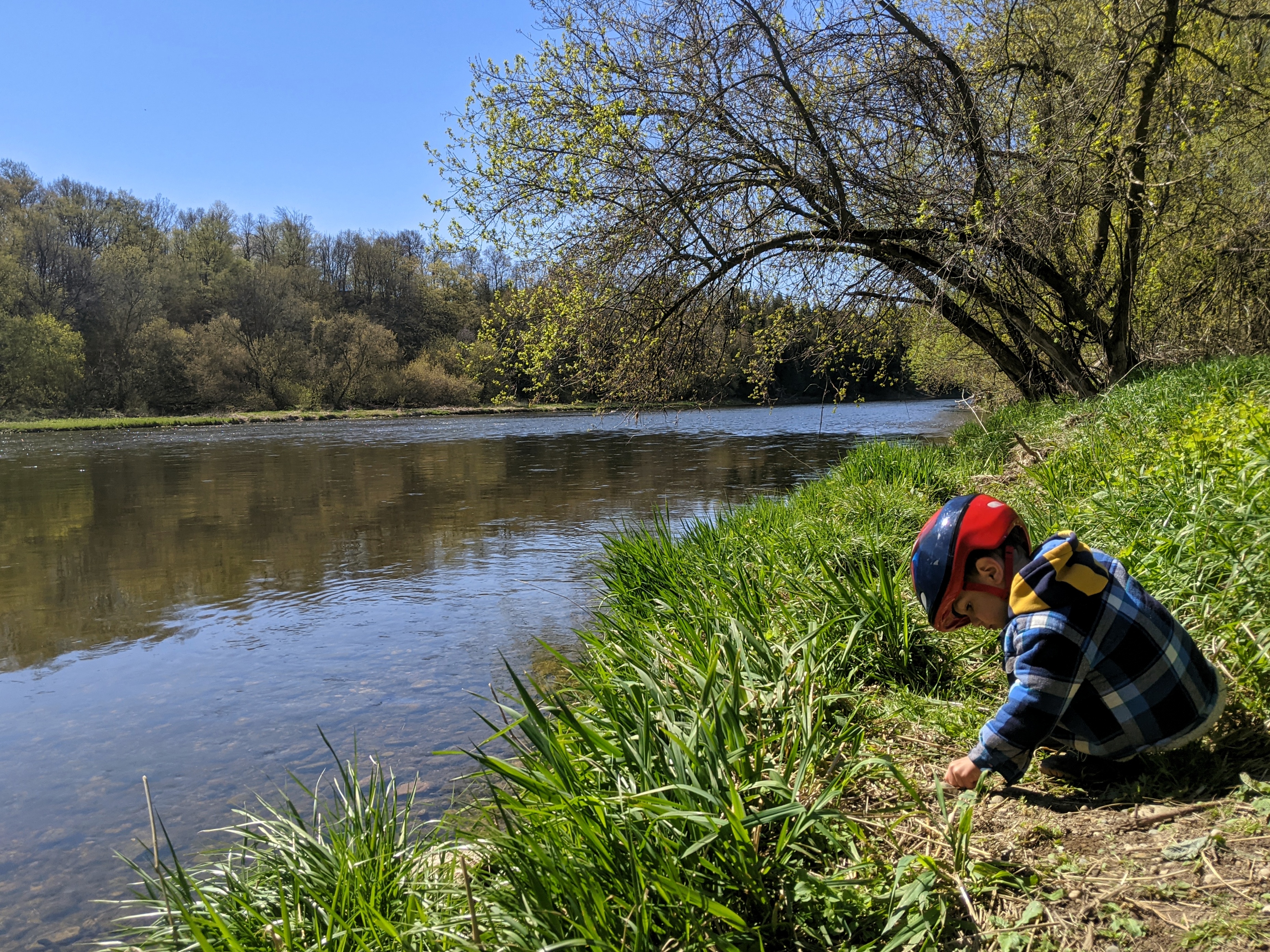
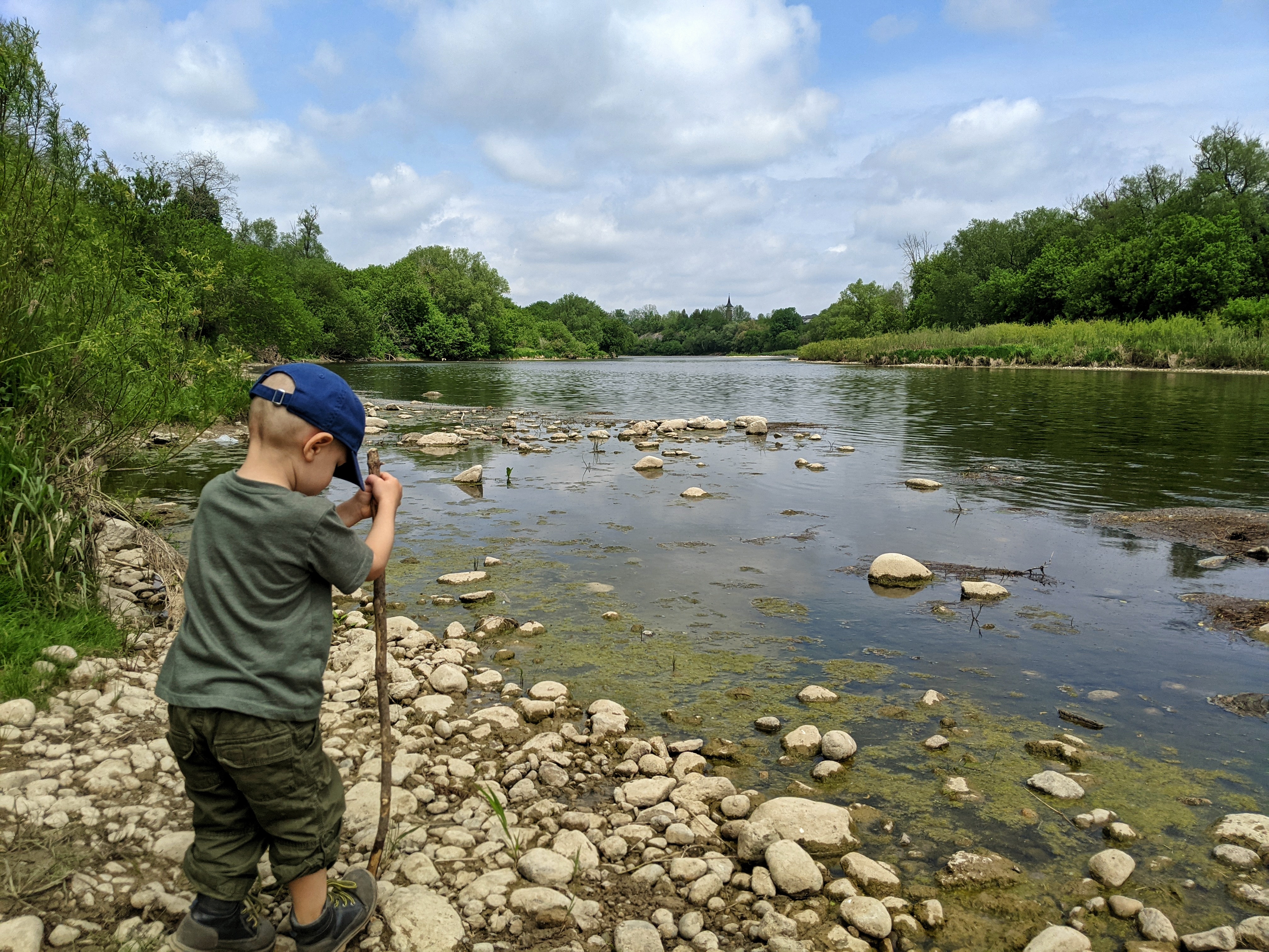
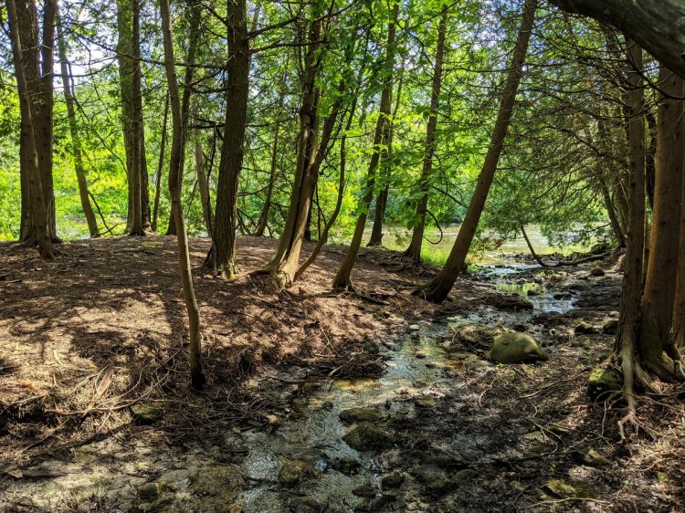
If you’re lucky enough, there are neat local features like a watercourse or woodlot to check out. These are places to be adventurous and interact; watching leaves go over a waterfall or what insects are in a log are super exciting and educational activities.
Conservation areas are sometimes a little more far flung from home, but offer a prolonged escape. These are opportunities for meaningful bonding over a picnic, or just giving your partner a break.
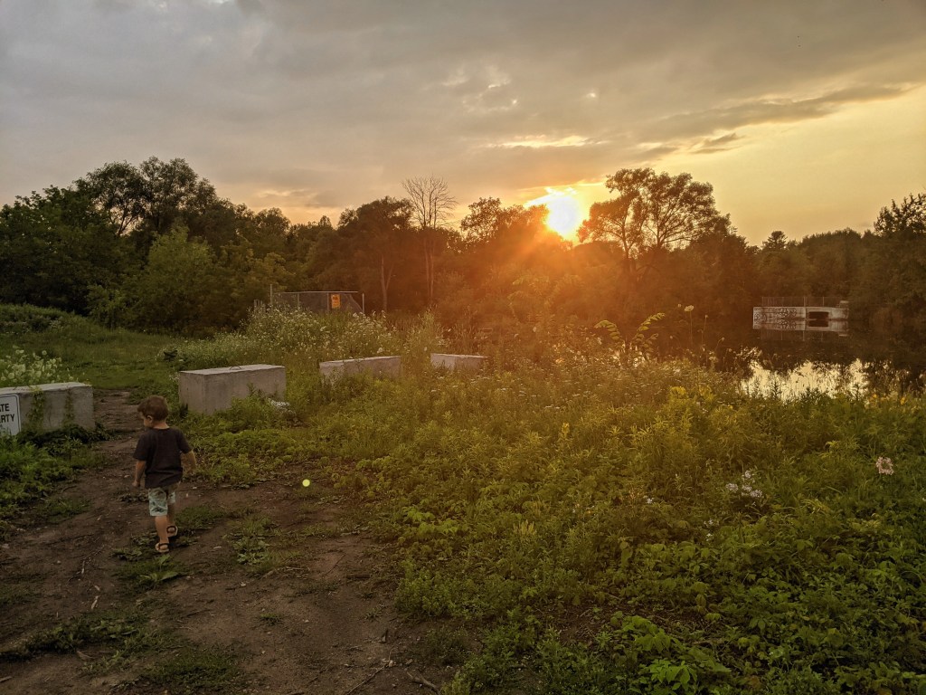
A riverbank can also be a spot for discovery and play, and connecting with nature. Fish, bugs and frogs are a chance to learn and marvel, and rock skipping is just plain fun.
Sometimes running the same old ground over and over can get boring. This should drive you to think creatively, peruse a map, and check out the other little parks and open spaces you haven’t been to before. Other times, a breath of fresh air is all that’s needed, even if it’s somewhere familiar. That said, a little one can help you explore different elements of the same space and look at things from a different perspective.
So don’t ever write your local parks and open spaces off, and don’t settle for the same old spot. Get out there, recharge, take a different perspective, and find a special hidden space.
Growing up in southwestern Ontario as a kid, and eventually as a teenager without a drivers licence, I didn’t get around a lot. Then that began to change as I applied to university, and started consider where I was going to live and study for 4+ years. I got three acceptance offers, and was weighing them all.
Then I went to tour the campus and the city of Guelph. After one visit, I was set on it. I fell in love.
So as I expand to a fourth city in the Metroscapes universe, I am strolling in a bit with rose-coloured glasses. Yet at the same time, after exploring other cities, it’s gone from the big town where I began my independent life to something that feels small and isolated.
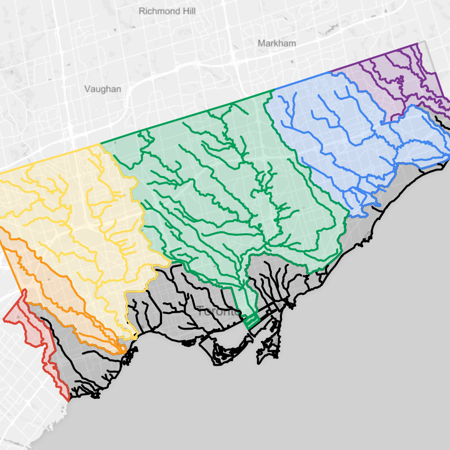
Toronto, Hamilton and the Tri-Cities (at least my scope of walking an analysis) cover 634, 323 and 320 square kilometres, respectively. Guelph comes in at a fraction of that, 88 square kilometres or urban area all surrounded by rural lands. On top of that, the watersheds are getting downscaled too. Toronto has 6 major rivers and creeks draining to a great lake. The Tri-Cities has one major river, the Grand River, and some notable tributaries. Guelph is intersected by the Speed River, which is actually a tributary of the Grand.
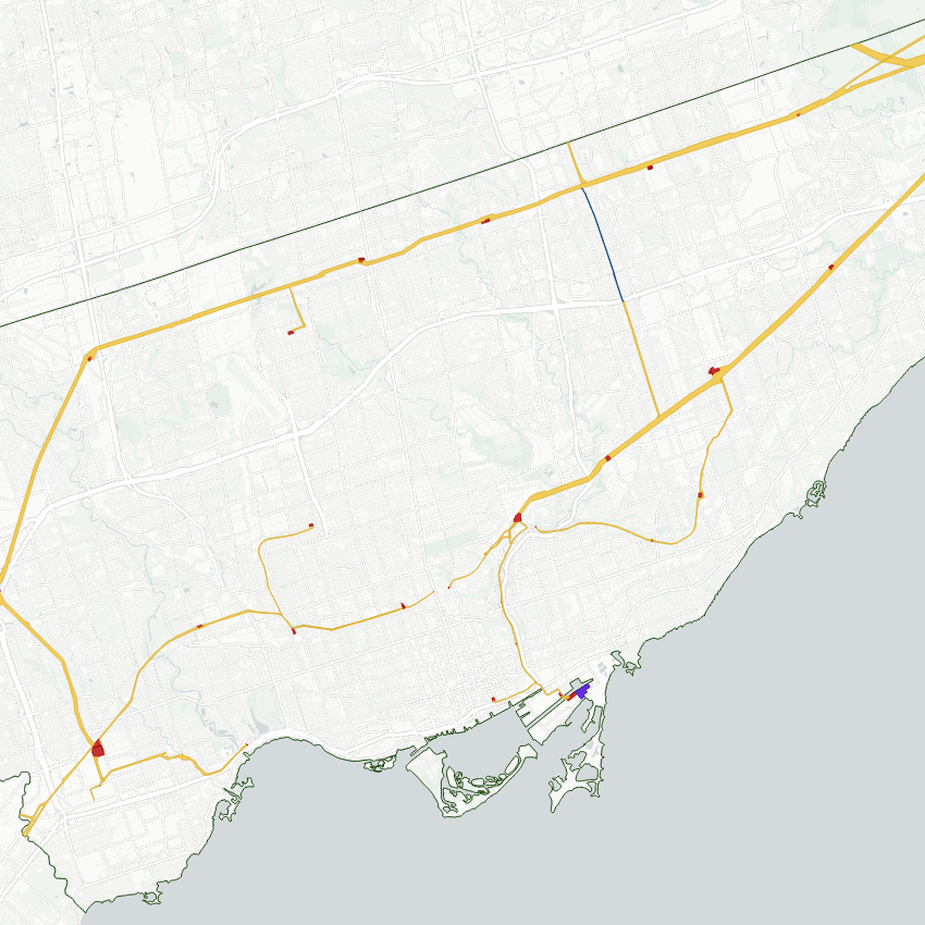
Nonetheless, I’ll do what I do, even at these smaller scales. I’ll cover the city on foot. I’ll delineate some neighbourhoods. I’ll break down the subwatersheds. I’ll highlight the hydro corridor (yes, singular).
I’ll also be exploring a changing city. It’s estimated to have grown up to 20% since I first moved there over a decade ago. The last greenfield area in the south end is slated for development. The City is planning to annex a quarry pit to convert it to housing. The downtown has been building up with a new transit hub and relaxed height restrictions.
So I’ll be going down memory lane a bit, but covering the city with a new scope. I’ll be bound to run into a few surprises.