In 2014, I moved to Toronto, and I needed something to fill up my time on the weekend. I started taking walks. Lots of them, one or two every weekend. I even started tweeting about them and adding pictures.

Then on February 15, 2015, this website was launched as a clunky Blogger site. It was a place to rant about the days in Rob Ford’s Toronto, but I also added a page to track / organize some walks I had taken with a half-decent Twitter thread. It was a start.
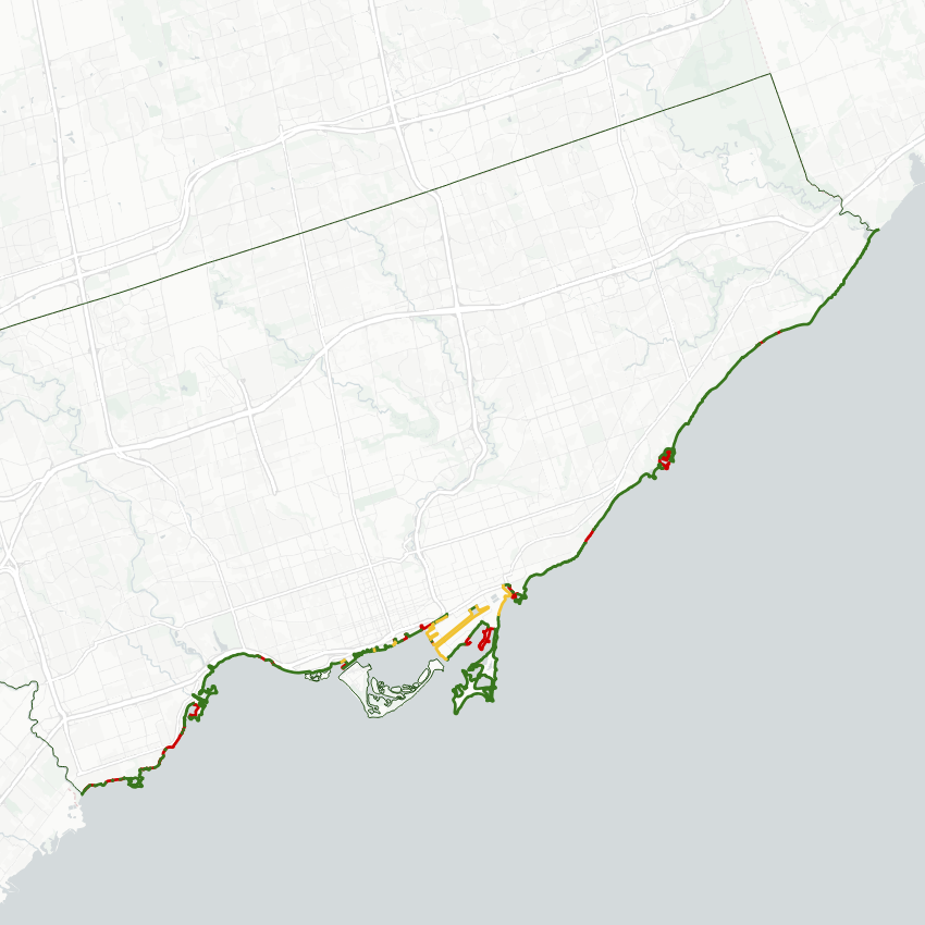
Something happened in the latter half of 2017. I took a walk along Etobicoke’s shoreline, and noticed how public access along it was very fragmented. I wondered how it compared to other parts of Toronto, like downtown, the Port Lands and Scarborough.

So I started doing something new. I mapped it out (manually), and input the data into some spreadsheets to do some analysis. I was able to demonstrate, through hard numbers, that Etobicoke’s shoreline was vastly more fragmented, and with more of it in private exclusion, compared to other parts of the city.
Blogger was not really up to the task of handling all of this new information; it wasn’t capable of embedding the pictures, maps and spreadsheets like I wanted to, or if it was, it was going to be very difficult for me to figure out how to code it. I needed a user-friendly and proper web platform.
So I did a migration 3.5 years ago, making it into something different entirely. In addition to my walks, I made a space for analysis and information about the subject matter of my walks: shorelines, watersheds, neighbourhoods, corridors.


Up until this point, it’s all been from hand-drawn digital maps I did myself, either through my own observations and/or cross-referencing other sources. It was painstaking work, but I was happy with the result.
But I knew it could be better.
These days, the most powerful maps come from a Geographic Information System (GIS), which contain multiple layers of large datasets of points, lines, and shapes and the metadata attached to them. Naturally, I was attracted to this, with the detail and the wealth of open-source data that governments offer these days, which would enable me to refine my maps. But it felt like a huge leap.
So I enrolled in and recently completed an introductory course at [X] University to secure myself some of the fundamentals. It was an eye-opener; not only was I going to make detailed maps, but I could complete a higher level of analysis. I can now draw on more sources of information, crunch out new data, and visualize it way more efficiently than I could ever achieve with hand-drawn maps and spreadsheet data entry.

How many people are a five-minute walk from publicly accessible shoreline? What proportion of ravine lands are in private ownership? Which segments of railways and highways pose the greatest barrier based in an index of population and walking distance? These are questions that I could tackle in GIS.
So I find myself at the cusp of a similar spot I was in 3 years ago, looking at my current mapping data and thinking “how did I settle for this?”
With that, you can expect changes in 2022. I started recompiling my existing data into more detailed GIS shapefiles (though I had a bit of a setback). This will unlock new projects and new analysis. It’s exciting to be on this path towards the next level of analyzing local metroscapes. And perhaps, finding a new way to spread pride in them. Thanks to everyone who’s stuck with me over these few years.
Keep trekkin’ on.

One thought on “Climbing to the Next Level”